


Laced With Wax interviews illustrator and designer Tom J Manning about his intricate and impressionistic artwork for The Talos Principle soundtrack double vinyl set.
By Thomas Quillfeldt
First-person puzzle game The Talos Principle asks a lot of philosophical questions: What does it mean to be human? What is free will? Can it be simulated? Why can’t you solve this easy puzzle, you simple-minded mortal?
So when Tom J Manning was commissioned to work with developer Croteam on a few different product releases — the PlayStation 4 Deluxe Edition boxed edition and, in conjunction with Laced Records, the 2xLP soundtrack vinyl — he relished the chance to grapple with the metaphysical questions that are posed during the course of the game’s narrative.
He filled us in on his creative process, the approach he took to creating the art for the vinyl set in particular, and offers some valuable tips for budding artists and designers.
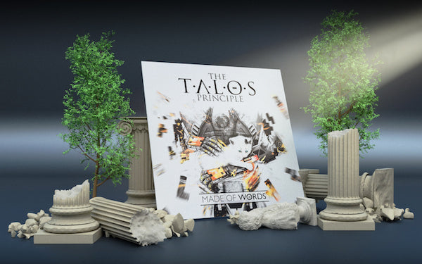
The Talos Principle ~Made of Words~, featuring music by Damjan Mravunac, 2xLP soundtrack vinyl is currently sold out.

You can listen to the soundtrack album on Spotify or YouTube:
In the beginning...
To get him started, Manning was sent sent a variety of assets for inspiration, including The Talos Principle logo files, key art by Croteam’s artists and various in-game screenshots. After glimpsing just a few of the assets, he was instantly intrigued: “For some reason I knew that this was going to be something special.”
A marketing screenshot from The Talos Principle: Road To Gehenna DLC:

Manning wouldn’t call himself a gamer per se, but decided to dive into the The Talos Principle for research: “I love puzzles, especially spatial, three-dimensional ones. With my work I am often juggling those kind of physical problems in design; that aspect, added to the deep, philosophical, perfectly told storyline in the game made for the perfect combination that felt so in tune with myself as an artist and designer.”
A taster of the world of The Talos Principle:
“The game felt highly polished and challenging, and I took that as the standard I should be setting myself for creating the artwork. I was dead set on trying to capture the emotions and the sens of intrigue that I felt the first time I played through.
“After finishing it, I was immediately inspired to transition other of my personal projects towards the human condition, the fragility of life and the relationship between technology and people (some of which I should be releasing before the end of this year on my Behance profile).”
The sound of Talos
It certainly helps that composer Damjan Mravanuc’s score for The Talos Principle (Spotify; YouTube) is a chilled-out, meditative affair — perfect music for working to. Manning admits: “It was hard not to listen to the soundtrack whilst working on this piece: it's so tranquil, yet in some places quite energetic.
“Very often I had it on repeat for hours. It was the relevant thing to do — when packaging something it's so important to sample the product and get a feel for it. This in turn inspires the look of the artwork.”
Early sketches for The Talos Principle vinyl:

Cover up
For whatever reason — to preserve mystique or just an oversight — Croteam didn’t explain to Manning the meaning behind one of the pieces of key art that they’d sent him: the image of the robot holding a kitten. “But, after playing the game, I came to the conclusion that the robot is displaying humanistic feelings of empathy.”
Manning’s illustrated interpretation of the robot & kitten key art for the PS4 edition cover which was later modified for the vinyl cover:

“Petting a cat is a very human thing to do, and, for me, the central point of The Talos Principle was whether artificial intelligence can ever be designed to think and act like a human being. In this light, the image evokes that perfectly. That's what was so intriguing.
“Ultimately, it was the only natural choice to continue to use this image for the [PS4 edition and vinyl] artwork, as the point it makes is so integral to the game’s narrative.”

Even though he was reworking an existing image for the cover of the vinyl, Manning was still able to add additional flourishes to his illustration.
One such touch was the word ‘FOREVER’ on the robot’s arm: “It was my little nod to one of the last lines of dialogue spoken at the very end of the game, which hit me quite hard. It was such a powerful line that I felt it truly summed up what it means to be human — that we want to live forever. Often our minds are so focused on 'forever' that we can forget how fragile and finite we are. So it was rather touching to hear it from a man-made artificial intelligence. I think our creations can say a lot about their creators.”

The technical challenge of vinyl artwork
Manning enthuses: “It was so exciting to be able to finally work on a vinyl package for the first time. Indeed, the whole Talos Principle project meant I could cross off two of my goals in quick succession — working on the art and design of a video game box and an album.”
An example section of one of the templates for designing vinyl packaging:

“I've worked on various packaging before, and am used to working with templates and the like. I knew I really wanted the artwork to be pixel perfect within the template and corresponding with Laced Records was extremely helpful in clarifying the various technical requirements, for instance how the artwork was going to fold over the seams.
“There were quite a few technical colour/ink coverage requirements I had to adhere to which were relatively new to me at the time, so it was a great opportunity to increase my knowledge in print design.”
The gatefold image from The Talos Principle vinyl:

“When I received the final product I was blown away by the print quality and colour accuracy. I was really pleased with how the artwork 'bled' around the edges, especially on the back where I had a load of complex shapes that I wanted to retain an even thickness all around without them being cut off.”

Principled design
Whilst the vinyl album cover and gatefold are impressionistic illustrations (with some extra digital effects), by contrast the disc labels and back cover are symbolic, precise and mathematical. Manning explains: “I've always been a graphic designer as well as an illustrator, and have generally mixed the two disciplines together.
“With this vinyl, I knew I wanted to repurpose the Illustration from the PS4 box art and improve upon it which led to that being the cover. Then I had to step back and ask myself: with so much energy on the front, did I really want to continue that around the whole package? Or should I try and sum up the calmer elements of The Talos Principle in a graphic style? I wanted the tracklist to be clean and to stand out, and I felt that trying to place text in a whirlwind of impressionistic art would drown it out.”
The back cover and B-side disc label from The Talos Principle vinyl:

“It’s right to describe the back cover and disc artwork as symbolic and mathematical. I wanted to visualise the complex nature of the game’s puzzles, as well as adding some prestige that mirrored how polished I found the game to be. Gold on black was the only natural choice of colour, especially in reference to some of the art used by Croteam in various adverts for the game.
“I had already made up my mind to have one of those Tetris-style puzzles on the back cover — they were often were the bane of my first playthrough of The Talos Principle! I spent many hours solving them, with each successive puzzle getting bigger and more complicated that the last.”
Detail from the back cover of The Talos Principle vinyl:

“The icons I added as a nod to the game’s protagonist, as well as the various obstacles — especially those heart-stopping mines! The layout of the icons were influenced by Egyptian hieroglyphics; again another reference to the game’s themes.”

“The disc labels came to me before the back cover, and influenced the overall aesthetic.” Manning snuck in yet another reference to aspects of the game by including fragments of QR codes — which appear throughout the world of The Talos Principle — on the A-side disc labels. “I knew I wanted something that followed the curvature.”

“I was inspired by the disc artwork created by renowned designer Stefan Sagmeister for the album Mountains of Madness by H.P. Zinker. I just loved the prestigious looking circular motion around the disc's surface, and wanted this to influence my design.”

Commissioner Croteam
As a freelance designer, Manning feels fortunate to have worked with some impressive clients who have given him the latitude to run with his own ideas — thus he has found the process from commission through to the final approved artwork to generally be smooth.
“With this project it was easy to to dive right in [to the reference material] and be immersed. Projects tend to run smoothly and are ultimately successful as long as you spend time listening to your clients — they are, after all, artistic collaborators as well. You have to genuinely care about what they themselves do, and approach the work with honesty, integrity and passion.
“The only challenge I faced was drawing the massive aqueduct that adorns the gatefold, as there was a lot of detail and accuracy that was needed to convey such a monolithic and beautiful structure.”

Stylistics
Manning’s other work — at least that published online — suggest he is fond of creating images that are essentially black and white, before splashing a limited number of additional colours over them for effect.
One of Manning’s illustrations from his BEAST | Extreme Sports collection:

“With my own style of illustration I often avoid using backgrounds, preferring to let the foreground do the talking most of the time. However, as my style has developed, I find that in my current work I’m employing the use of coloured or textured backgrounds in order to 'anchor' the foreground in place.
“My style can sometimes be very energetic (or erratic!) in terms of the mark making used with paint or graphite, therefore I find that adding only one or two colours is enough without overdoing it. My style is still evolving — as all styles should be. Initially, I was very much influenced by music and movement which led to very expressive marks and splashes of vibrant colour.”
Two of Manning’s earlier pieces: (left) The Places Where I Belong 2011; (right) War Horse, 2012:

The humanity of the physical
Whilst he has put in the work to learn how to wield the digital and online tools that are vitally important to designer-artists in 2017, Manning also values his ability to illustrate using his trusty pencils, pens, paints and paper: “There are lots of advantages to being a ‘traditional artist’ in a digital world, although I work across both.
“I believe that traditionally created artwork will always have more value than that which is purely digital. There is a lot more physical human contact involved with every brush stroke, there are a lot more happy mistakes, and more line work than there is with digital.”
An illustration of a Sailfish by Manning for his NIKE WILD concept project:

“Don't get me wrong — I love digital, and its extreme relevance as an artform. It's just that I feel it doesn't capture that footprint, that pheromone of emotion that is instilled when the hand touches the surface of the paper. I think people can relate more to physical art and therefore can appreciate it more.
“The only time I feel I can relate to a purely digital piece is if it's simple and to the point — when it's not trying to emulate a traditional [physical] piece. There's a lot of digital work out there that tries to emulate traditional tools (paint textures etc.) and yet somehow they often feel distant despite the fact that they may look very cool or modern.
“The digital image of the robot holding the cat that Croteam created worked for me because it was a very honest image: it is what it is, not sugar-coated with special effects, textures or patterns. And because it was honest about itself, it told its story clearly and retained that emotion.”
One of the key art assets that was sent to Manning by Croteam, on which he based the vinyl front cover:

Tips and tricks for budding artists
Manning says: “I often get students and young designers asking me for advice, and I always tell them the same thing — love what you do.
“If you are genuinely passionate about working in the creative industries then you will put the work in; but it's a tough industry and not everyone makes it. Always look for opportunities to train yourself up: anything from drawing and learning the software to interpreting creative briefs.
“Be open and flexible to anything — you never know what avenues you will go down. For example: I graduated from university as an illustrator and (partially as a) graphic designer; five years later I now do filming/animation, 3D modelling, storyboarding, minor coding and full blown graphic design!
“Keeping an updated online presence is essential in today’s digital age and I've found Behance to be very useful in getting those first few commissions. Use Twitter, Facebook and Instagram to post your work and promote yourself as a professional. And don't fall into the trap of trying to gain followers — keep your content real and honest.
Above all: “Take the quality of your work very seriously and the clients will come.”
Detail from the gatefold of The Talos Principle vinyl:

Gateway discs and meaningful games
On the vinyl revival, Manning jokes: “I thought vinyl had never really left! But it seems that over the last decade there has been an analogue revival as well as the whole ‘retro’ style. I read that a few months ago Sony stated that it is going to produce vinyl in-house for the first time since the 80’s, which is crazy in a way — that the demand has exploded in recent years. I guess things eventually get brought back, recycled and reinterpreted every so often. It’s same with art styles.
“I don't own a turntable… yet. But, as the only vinyl record I own, The Talos Principle soundtrack has inspired me to get a decent record player and who knows after that — it might just be the first in a growing collection! There's something about ‘the old’ that can never be truly replaced by ‘the new’; downloadable music just doesn't have the same charm as vinyl.”
And as for gaming, Manning is very selective: “The only things that attract me to a game are if it has a unique art style and/or an immersive, in-depth story. I need to be able to take something away from it that justifies the length of time spent playing.
“In terms of the art style, I really like the Half-Life series, the Amnesia series and, more recently, SOMA and the Metro series. So I guess you could say that I like my gaming worlds bleak, dystopian and atmospheric, with deep stories that question your perception of what it means to be human.”
Screenshots from SOMA, Amnesia: The Dark Descent and Half-Life 2:

Tom J Manning is an illustrator and designer based in Bristol, UK – www.tomjmanningdesign.com | Behance.net/TomJManning | Twitter: @TomJManningART | Facebook.com/tomjmanning
You can see more of his work for The Talos Principle PlayStation 4 Deluxe Edition and soundtrack vinyl via his Behance profile.
The Talos Principle ~Made With Words~ 2xLP soundtrack vinyl is currently sold out. Check out our interview with Croteam’s audio lead, composer and chief marketing officer, Damjan Mravunac, about his music for The Talos Principle and Serious Sam series.
