

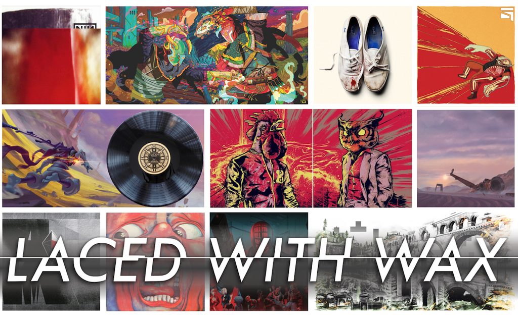

We spoke to some of the illustrators and designers that have created beautiful art for Laced Records releases: about their design philosophy, their favourite covers and gatefolds, and how they approach album artwork.
By Thomas Quillfeldt
Screens are everywhere today, with every corner packed with as much visual information as possible. Endless feeds of imagery scroll past our sight and consciousness. It’s useful, I guess. Efficient. Optimal.
It’s also goddamn overwhelming, often dehumanising, and harmful to our eyes and minds. Sometimes, it’s nice just to look at a physical picture; something you can hold in your hands, and tilt to catch the light just right. Something where the colours sit comfortably on the surface, rather that stab at your retinas with artificial light.
Artists are a group that increasingly know all about staring at screens for countless hours; at least those illustrators, painters, photographers, and graphic designers that choose to harness digital tools. Often, they’re creating digital art in order to better be able to earn a living, as well as simply keep up with the times. So I’m told, it’s a rare treat to see their work in print.
There are a few bastions of non-advertorial, physical art outside of galleries, among them magazines, art books, — and music album packaging. One happy side effect — or is it a driving force? — of the revivification of the vinyl format is the increase of opportunities for artists and designers to create compelling printed art to be spread across multiple 12” by 12” panels.
In order to celebrate the medium of vinyl album artwork and sleeve design, and highlight some of the pieces that have graced Laced Records records, we spoke to many of the talented artists that the label has worked with so far. Specifically, we asked about what they personally like to see on albums; how they go about designing for the wider gatefold canvas; and some of their favourite album art from their own record collection.
Subtly does it
 Caspar Newbolt, aka caspar (v), is a New York-based artist, graphic designer and filmmaker
He was responsible for the overall design of the vinyl and CD packages for 65daysofstatic’s No Man’s Sky: Music For An Infinite Universe soundtrack album, on which he collaborated with illustrator John DeLucca (more from him later).
[editor’s note: caspar is allergic to capital letters]
caspar (v): “[in terms of album art] i want to see something that makes me walk over and grab a record violently off the store shelf; or immediately make me head to the nearest streaming service mad with curiosity about how this record must sound. record artwork, to quote a movie, should feel like 'bottled promise.'
“beyond that, i want a sleeve you can get lost in, whether it’s the haptics of it, the smell of it, the details in the artwork, or something you immediately want to frame. a lot of people have a very throwaway attitude to vinyl artwork, but i buy vinyl as much for the sleeves as for the music. we tend to forget how, for some people out there, a sleeve can draw someone to music they would have never otherwise listened to.
“the vinyl gatefold design that single-handedly made me want to be a graphic designer is for Nine Inch Nails’ The Fragile, designed by David Carson — it’s a very simple combination of blown-up, zoomed-in, richly coloured photographs and beautiful custom typography.”

www.turntablelab.com/products/nine-inch-nails-the-fragile-180g-vinyl-3lp
caspar (v): “at first glance, i was tickled by the cropping of the band’s logo on the cover, as it felt like a beautiful and emotional way of expressing that this is the band's return after five years with a softer, more timid, more experimental, and less nihilistic record.”

caspar (v) “furthermore, up to that point, this was artwork that you’d never expect from this particular band, and thus it transformed the perception of their music into something else entirely. one review at the time said that this record was like ‘industrial rock’s Pet Sounds.' this was a statement that stuck with me as i knew i wanted to be responsible for making artwork that defied preconceptions about a band or film, to the point where comments like that might be made.
“also, for The Fragile, the music and artwork was different for the CD, vinyl and cassette releases in subtle ways that only fans would notice or care about, which made it all the more rewarding.
“i think album artwork should very closely match the music, but one could argue that all associations therein are objective. i know Peter Saville feels quite the opposite to me in this regard [art director/graphic designer known for Factory Records/Joy Division/New Order covers]. he feels you can’t communicate anything with a record cover, so why bother?”

Peter Saville's artwork for New Order's Music Complete.
“i’d say that my record cover for big black delta’s first album [BBDLP1 - YouTube] tells you a great deal about what you’re about to hear.”

See more of caspar (v) and Version Industries’ work for Big Black Delta here.
caspar (v): “i try my hardest to make it look like the music sounds (to me). looking back, i think i’ve succeeded and failed many times in that regard. either way, the reason i do this is because i often cannot listen to a record if the artwork is bad. a great example of that is the new A Perfect Circle record [Eat The Elephant], which has such an awful cover image that i feel embarrassed to listen to it on any streaming service, and would never have the record on my shelf at home. it’s a shame as i love that band.”

The front cover of A Perfect Circle’s Eat The Elephant.
For caspar, the gatefold spread is an important space, design-wise, and is an excellent opportunity to surprise and delight: “i don’t know which came first, Playboy centerfolds or the vinyl gatefold, but there’s always going to be this feeling for me that something exciting might be revealed. i like to feel responsible for the impact of that reveal within the context of what the band is trying to communicate. the very nature of having to see the front and back cover first before you dip inside means the designer should already be thinking like a film editor would, and, thus, how they can move people by unexpected juxtapositions or crescendos.”
He created the gatefold for the No Man’s Sky: Music For An Infinite Universe double CD...

...and for the Laced Records double LP (not to be confused with the iam8bit release):

caspar (v): “everything has to start with an idea for me; if there’s no idea, i have no interest in making anything. i see records all the time with no idea — it’s all aesthetics, and it makes me think less of the music and of the band. a cover ought to have a mystery, and to reveal itself; like the first time you meet someone you’re attracted to at a party. you yearn to find out more about them, to the point of distraction. maybe later you find yourself kissing them in the street or back at their apartment, where so many more questions are answered. each page or piece of the artwork should feel like that kind of journey. the simple fact is that, with a band, you absolutely can and should judge a book by its cover. the attention to detail they put into the sleeve tells you how seriously they feel about the music.”
Check out Laced With Wax’s interview with caspar (v): “On the record: Exploring the art of the No Man’s Sky vinyl.”
Give the people something to look at
 Swedish musician and illustrator Niklas Åkerblad — aka El Huervo — is known for chill beats and colour violence
Having made significant artistic and musical contributions to the Hotline Miami series, he was commissioned to create artwork for both Laced Records’ Hotline Miami Collector’s Edition Vinyl (sold out at the time of writing, but repress plans are afoot, although some way off), and iam8bit’s Hotline Miami 2: Wrong Number vinyl set.
A gatefold image, for El Huervo, needs to include “a stellar illustration that really pops, and can work as a stand-alone piece. It feels kinda embarrassing to say, but I think there’s still a lot that can be done in this area, conceptually.” He shouts out Brazilian illustrator and graphic designer Protski’s gatefold for the Hotline Miami vinyl set — a project on which they shared art credits.

Protski’s triple panel gatefold artwork for the Hotline Miami Collector’s Edition Vinyl, featuring game characters (L-R) Don Juan, Richard, and Rasmus. (Below, from left to right) inside panel, back cover without tracklist, and front cover by El Huervo.

El Huervo: “By default, I do like to pack my own images — so I see the gatefold as a vista to be filled with stuff. It's an opportunity to really go nuts.”
The way he approaches a commission like this is to dive into the research: “I listen to the music and try to find visual cues and colours that match the feeling, the atmosphere. I also fill my head with associated imagery, and just see what sticks — I try to find an emotional vibe, rather than an intellectual one.”
There’s a difference, for him, between commissions for art for video game soundtrack releases and straightforward commercial music release: “When it comes to games, there’s usually a narrative there to begin with, so you don’t want to stray too far from that path. When it comes to musicians, they look to me as an artist to find that narrative on my own.”

El Huervo’s gatefold for the Hotline Miami 2: Wrong Number video game soundtrack triple vinyl set.
Laced With Wax previously interviewed El Huervo about his punchy art for the Absolver OST double vinyl (currently in stock). Commenting on the process of creating the Absolver sleeve, El Huervo said: “I spent a couple of days going through an ocean of awesome pictures and documents about the lore. Beyond playing the beta, that material helped me get a better idea of what the game was; I could grasp the emotional idea behind it all, which made it a lot easier to have a powerful vision of what the vinyl artwork should look like.”

El Huervo’s gatefold image for the Absolver video game soundtrack double vinyl. (Below) The various stages of his colouring process.
![]()
El Huervo commented further on the gatefold: “At first, it was in danger of just being two martial artists in masked pitted against each other. [But I wanted to] put something more in there, something larger than life. I wanted to have a primeval — or maybe even futuristic — vision of two core forces in this world, battling it out; try to capture two Absolver gods locked in an evenly-matched battle.”
Laced With Wax also interviewed El Huervo about Hotline Miami’s legacy, and his work on the vinyl set.
The art of storytelling
 Tom J Manning is a UK-based illustrator and designer
He worked with Croteam on the PS4 edition of The Talos Principle, as well as with Laced Records on the soundtrack vinyl (currently sold out).
Regarding record gatefolds, Manning comments: “It’s a broad canvas that demands a big showstopper piece. It's akin to opening a book and finding a brilliant story inside; for me, the very nature of unfolding a gatefold engenders that sense of surprise. A canvas like that deserves to have something special on the inside, perhaps something more intimate [than the cover], that takes full advantage of the wide format to surround and immerse the viewer — much like the music would the listener.
Manning’s first ever album, bought as a teen, was The Rising Tied by Fort Minor (actually a side project of Linkin Park’s Mike Shinoda). “It came in a tri-fold cardboard CD sleeve, which I loved — it had such a different feel to standard jewel case plastic, and there were plenty of panels for artwork. I remember being really inspired by the designs and illustrations that flowed across each panel; a mash-up of text and imagery that subtly revealed what was in store for the listener.”

(Above) Fort Minor’s The Rising Tied CD gatefold. (Below) The Record Store Day double LP. Artwork by Mike Shinoda.

www.turntablelab.com/products/fort-minor-the-rising-tied-colored-vinyl-vinyl-2lp-record-store-day
Manning: “Good music tells a story, and the accompanying artwork should support that storytelling — I don’t feel like the default cheap plastic CD case enables the celebration of a great album the way a gatefold package can.
“[An opened-out gatefold] is an opportunity to break out into landscape format, which will influence the composition of the design.” Although he tips his hat to minimalist designs favoured by caspar (v), Manning leans towards the maximalist sensibilities of El Huervo: “Overall, I like to see something on every panel; I admire subtle and minimal designs, but my style is such that I like to plaster [stuff] across the entire gatefold.”

Tom J Manning’s double gatefold image for The Talos Principle ~Made of Words~ video game soundtrack vinyl.
Manning: “With every project, I will start with research and rough sketching. Research can include looking at similar media and keeping up to date with various trends and styles, although it's hard to resist the temptation to jump straight in [to drawing]. That said, jumping straight in can often yield interesting results, so I try to find a balance between research for inspiration, and diving in. When I worked on The Talos Principle vinyl, I remember not doing any upfront art research, as I was already very familiar with the tone of the game and the themes of the narrative."
He comments on artists imbuing images with a sense of movement: “It will vary from designer to designer depending on their own individual style, but my style is always moving, with fast sketchy lines and splashes of paint — it's very action-orientated.
“It can depend on the style of music too. The Talos Principle soundtrack (Spotify; Apple Music) is ambient and calm, but includes a few tracks that have this rare kind of energy, like the world is going to end. That influenced the explosive, disintegrating style of the front cover.”

Manning’s cover for the album.
Manning: “Personally, I prefer to lean towards creating artwork that is a visual representation of the music — but never a true representation. There should always be room for interpretation, as music is so diverse, and can be interpreted in many ways. I prefer to be more abstract, and hint at various things that people will recognise.
“There is plenty of space to experiment. This format creates many opportunities for designers to keep things flexible, whether they want to be detailed, or minimal with the space.”
Laced With Wax previously interviewed Manning on his sleeve design for The Talos Principle soundtrack vinyl.
Pack it in
 Joey Rex Cardenas is a US-based illustrator
He teamed up with Laced Records to design the STRAFE soundtrack vinyl, both the Limited Edition (sold out), and Standard Edition (in stock at the time of writing).
One of Cardenas’ favourite sleeves is a classic rock classic: “I'm really into the cover for King Crimson's In the Court of the Crimson King. It's a painting of this screaming dude's face that’s super abstract, very ‘60s psychedelic; there's something evocative about this particular piece, though it’s not typically what I’m into. I first saw it as a banner in a guitar shop, but I didn't even know it was an album cover. I would often mindlessly stare at it whilst in the middle of a conversation.”

(Above) Barry Godber’s 21st Century Schizoid Man, the back (left) and front (right) cover for King Crimson's In the Court of the Crimson King – more info. (Below) The album’s gatefold.

Cardenas: “Personally, I’d love to see more illustrations of big, highly-detailed scenes [in vinyl artwork]. As an illustrator, I’m biased of course, but I feel like a gatefold spread is the perfect place for that sort of thing. It's literally a 1' x 2' card stock poster, so why not give people something to look at? You get to pack all these little vignettes into a drawing, and have them come together to create something whole. I'd also be very interested in seeing a vertical illustration on a gatefold, like the way a poster folds out of a magazine. If I ever get to design another vinyl, I gotta try that!”
When approaching the STRAFE commission, Rex was initially daunted: “A vast majority of the work I've made has been with a vertical or square composition in mind, so I'm not accustomed to working horizontally at all; I feel like that's the case for most illustrators, unless you happen to be a background or concept artist.”

Joey Rex’s gatefold for both Limited and Standard editions of the STRAFE video game soundtrack double vinyl.
Cardenas: “I still wanted to push myself, test my limits by drawing as much as possible for the vinyl sleeve interior. There's a ton of potential to experiment with this format, and I'd say that, for me, the STRAFE vinyl was very experimental in a lot of ways.
“An insane amount of research and planning goes into most of my projects, and is arguably the most important part of making work for me. I brainstorm ideas and revise them a ton in writing before I even start sketching sometimes. The more time I spend planning, the less time I spend fumbling around a piece, wasting time. On visual reference alone, I like to spend around two days compiling images for a single drawing.
“With STRAFE, it was a little different. The game director Thom Glunt gave me the idea and a first sketch — we were screen-sharing over Skype, and he starts drawing this thing in Microsoft Paint with a mouse whilst explaining his vision to me.” Glunt’s original masterwork:

Cardenas: “He thought I was kidding when I said I was going to base my entire drawing around his Paint creation, but I made him send the file to me, and literally used it as a initial sketch! I still crack up thinking about it.”

(Above) An early sketch of the STRAFE video game soundtrack vinyl gatefold. (Below) The image outline before colouring.

Cardenas: “The vision was of an interior with a ton of action and violence, and a sleeve exterior that was calmer and more sophisticated. I think we achieved this with our final product, and I'm glad we took that direction. It created more visual balance and variety in the whole package, much like the actual music [Spotify] from the record.”

Joey Rex’s (left) back and (right) front covers for the STRAFE OST Standard Edition vinyl.
Cardenas: “Having a vinyl sleeve closely match the music is cool, but I'm also a huge fan of creating a juxtaposition between art and music.
“Imagine if Don Ivan Punchatz, who designed the original DOOM box cover art, designed the packaging for a Best of Beethoven record. How sick would that be? I'd preorder a vinyl like that in a heartbeat.”

The author of this article takes full responsibility for this joke.
Full-bodied is best
 Thomas Vasseur aka Carduus is a graphic artist, Co-CEO of developer Motion Twin, and Art Director of indie hit Dead Cells
Regarding record sleeves: “I like to see visuals with a strong identity. It needs to succinctly evoke the music, and represent some subtle elements that transmit an idea.”
Like Joey Rex, Carduus cites an iconic classic rock sleeve as a favourite: Gerald Scarfe’s gatefold design for Pink Floyd’s The Wall. The gatefold includes several characters from the rock opera, including Pink’s Mother, Pink’s Wife, and The Teacher, emerging from the titular wall:

Carduus designed the sleeve for the vinyl of Yoann Laulan’s soundtrack to Dead Cells (vinyl now available; digital OST on Bandcamp). Laced With Wax recently interviewed the composer about his score.

(Above left - back cover; right - front cover) Thomas Vasseur’s sleeve for the Dead Cells soundtrack vinyl; (bottom) the gatefold.

Carduus: “[The final gatefold design] is a vision I needed to share with [composer] Yoann to create the Dead Cells vinyl artwork. This game took both of us outside our artistic comfort zone, and I felt the urge to join Yoann on his personal aesthetic. I haven't found my own art style yet, and I hope I never will. It's much more exciting to explore, especially when you work with talented and inspiring people like Yoann.
“As a digital artist, the most satisfying thing for me is to see my work printed as a physical object. Looking at it and taking it in my own hands is way more satisfying than looking at it through an OLED display.
“So, from that perspective, it has to be something that you can use to tell a story, to evoke a feeling of sentimentality and attachment. You're trying to give the people who buy it the same feeling you have as an artist seeing your work brought to life in the flesh.”
Faced with a blank canvas when creating the Dead Cells vinyl sleeve, Carduus admits to feeling a bit nervous: “It can be very intimidating at first, but it gets really exciting as you move through the process.” Here are some composition sketches he tried out:

Carduus: “In the end, I chose the most dynamic one. After that, I challenged myself to do this in an art style I've never used before. This was a real artistic release for me, having spent two years working with the same art direction [for the game]. I personally love images with dynamic compositions. However, it's really important that the image tells you a story and/or makes you ask yourself about what's really happening on the paper.”
Mood, music
 John DeLucca is a US-based illustrator and designer
DeLucca sees as valid both the approach of having record sleeve artwork match and resonate with the music, and also standing in contrast to it. “The art for an album is like an advertisement for the music, and I think it should, in some way, reflect or comment on the music. Now, whether that's in the actual content of the art, or the overall feeling or tone, is up to the artist.
“Contrast can make for some very interesting packages — a great example is Sleigh Bells' Reign of Terror. The music is loud and bombastic (Spotify); the photography is static with nearly symmetrical framing, and the content is evocative of the music and album title. It's a great package.”

(Above) The gatefold and (below) cover for Sleigh Bells' Reign of Terror. Art Direction by Derek Miller; layout and design by Steve Attardo; photography by Joe Garrad (see more of the photos for the package here).

DeLucca: “I’m also a fan of the whole package for Mondo's Halloween - Original Motion Picture Soundtrack double vinyl (Version A) — put together by Phantom City Creative. What an eerie image… They could have simply pulled something from the movie, but they went with a new black and white illustration that has a small punch of color to draw the eye.”

Designer caspar (v) and DeLucca have collaborated on a number of projects, including several album sleeves for the band The Protomen — at the time of writing, the package for Act II – The Father of Death has been nominated in four categories at the Making Vinyl packaging awards, including Best Gatefold.

The gatefold for The Protomen’s Act II – The Father of Death.
One of their collaborations was the Laced Records release of the soundtrack to No Man’s Sky, with caspar (v) adapting — some might say artfully defacing — DeLucca’s paintings for the album’s cover, as well as the disc sleeves of the 4xLP set.

(Above) DeLucca’s painting for the 65daysofstatic’s No Man’s Sky: Music For An Infinite Universe release; (below) caspar (v)’s incorporation of the painting into the album’s cover.

DeLucca: “I've been fortunate to work with collaborators who come to me with a concept more or less fully-formed. In those cases I can just start rough sketches to find a composition that best communicates the concept. If there is no clear concept at first, then I dwell on it, keep it in the back of my mind for a while and go about my day. Usually a new concept will click, and I can start sketching at that point. A lot of stuff comes to me while I'm jogging!”

(Above) Another of DeLucca paintings for No Man’s Sky: Music For An Infinite Universe; (below) caspar (v)’s sleeve design (left - front; right - back) for disc two of the four disc vinyl edition:

DeLucca: “I'm not really an artist that likes to have busy compositions — I like to keep things pretty simple and clear.” Faced with the larger canvas of a gatefold image, he’d go to work on it like any other piece: “All the same design principles can be applied regardless of canvas shape. I like that there's a lot of space, but, when it comes down do it, it's only one image, and it needs to be designed that way.
“Personally, what I love to see most [in a gatefold] is one big, beautiful image — preferably an illustration — with no credits or lyrics getting in the way. I don't like just a photo of the band, that’s boring to me. I want to feel like a special effort was made to wow me, or give me some insight into the music.”
Sizing up the artistic opportunity
 Benedykt Szneider is a Polish comics artist, and Creative Director and Concept Artist for Reikon Games’ RUINER
“The magic of vinyl sleeves is all about the size — it feels like the ultimate way to experience music art. There’s a potential pitfall there, in that sometimes producers of vinyl don’t always get the image quality right; it can be discouraging to see a lot of blurry stuff up close, if they haven’t managed to source the original images, and have scanned it from a CD sleeve.”
Szneider reckons that sleeve art for soundtracks should resonate strongly with the music: “The whole thing should match up. The art should become an extension of the music — and carry on, extend the identity. Records in general are a completely different matter, however; there is no recipe for a cult cover, and that’s a great thing because you never know what’s coming next.”
One of his favourite record sleeves it that for Grace Jones’ Nightclubbing, which “kicks ass on all fronts.” The image is a ‘painted photograph’ by Jean-Paul Goude, called Blue-Black in Black on Brown; it was the only sleeve artwork on the original record release, as the rest of the packaging was completely plain.

Jean-Paul Goude’s painted photograph cover for Grace Jones’ Nightclubbing.
Szneider’s favourite music album is Norwegian black metal project Burzum’s Hvis Lyset Tar Oss, which features a commensurately cheerful drawing by C19th/early-C20th artist Theodor Kittelsen on the cover:

When Szneider got the chance to design the sleeve for the soundtrack vinyl to the game he had laboured for years on — 2017’s RUINER — it came to him in a flash: “It was all about the duality — two LP’s, two main characters, two colours. I didn’t need to give it a second thought, because it was all there.” He jokes: “In fact, that artwork was made exclusively for the vinyl sleeve, and the game was really just a marketing asset to promote the record!”

The RUINER soundtrack vinyl (left) back cover, (right) front cover.
Laced With Wax previously interviewed Szneider about both the striking look of the game, and his approach to the vinyl. He told us: “It was very simple [to finalise the art for the vinyl]. I put it together a month before the release of the game whilst working on marketing assets and other merchandise… Having the hacker girl Her with the red background on the back worked well because she’s the reverse of the [unnamed] player character — that was really important to convey.
“I felt from the beginning that it was going to be a great product and I can’t wait to see it in print. Maybe somebody could have created some great custom art just for the vinyl, but I don’t care — I didn’t want to dilute the visual universe of RUINER.
“When I heard that we were going to get a vinyl, I thought ‘the world has changed’ because, when I was young, only cult products that had been out for over 10 years like Akira or Ghost in the Shell had vinyl releases. I love seeing stuff from the game in print, which you don’t get as much of a chance to do nowadays.

The RUINER soundtrack vinyl gatefold by Benedykt Szneider.
 Niklas Åkerblad — aka El Huervo — is a Swedish musician and illustrator
Printshop @ inprnt | Tumblr | Twitter @ElHuervo | www.elhuervo.com | Facebook | Instagram @ElHuervo | Bandcamp | Spotify
— Interview about Hotline Miami’s legacy and the art of the vinyl set
— Interview about the Absolver soundtrack vinyl sleeve art
 Joey Rex Cardenas is a US-based illustrator
www.joeyrex.com | www.behance.net/JoeyRex | Instagram @iamjoeyrex | Twitter @iamjoeyrex
 John DeLucca is a US-based illustrator and designer
www.johndelucca.com | Johndelucca.blogspot.co.uk | Twitter @JohnDeLucca | Instagram @wrongemjohnny
 Tom J Manning is a UK-based illustrator and designer
www.tomjmanningdesign.com | Behance.net/TomJManning | Twitter @TomJManningART | Facebook.com | Instagram @tomjmanningdesign
— Interview about the sleeve design for The Talos Principle soundtrack vinyl
 Caspar Newbolt — aka caspar (v) — is an artist, graphic designer and filmmaker
Rathausfilms.com (film work) | Versionindustries.com (design work) | Cargocollective.com/caspar (album covers) | Twitter @caspar_v | Instagram @caspar_v
— Interview about the No Man’s Sky vinyl
 Benedykt Szneider is Creative Director and Concept Artist for Reikon Games’ RUINER
Artstation.com/szneider | Twitter @BSzneider
— Interview about the RUINER soundtrack vinyl
 Thomas Vasseur — aka Carduus — is a graphic artist, Co-CEO of developer Motion Twin, and Art Director of indie hit Dead Cells
www.motion-twin.com | Twitter @carduusHimself | Artstation | Instagram @carduus
You can check out even more artist interviews at Laced With Wax:
— Pioneering comic book artist Śledziu on Shadow Warrior 2, drawing tips and Polish pop culture
— Interview: Kellan Jett on illustrating Where The Water Tastes Like Wine
What are some of your favourite sleeves and/or gatefolds? Let us know!
— Instagram @LacedRecords